Accent
#3d3935
potloodgrijs · warm charcoal · --color-accent
A Pimpelmees brand book — Utrecht, est. 2009
Pimpelmees is a Dutch wallpaper brand for children's rooms, founded by sisters Marieke and Ingeborg — both members of the BNO. Behang, behangcirkels, muurstickers, behangbogen, drieluiken and behangrand, hand-illustrated, nature-inspired, printed in Utrecht.
"Tover de kinderkamer om tot het fijnste plekje in huis met ons magische behang."
Identity
kraft · printed-paper warm tan · #e8dec8
Primary wordmark, monograms, square mark and faviconography — eight files for the right surface. Inherit colour where possible (terracotta / cream / dark variants); use the open / frameless wordmark on kraft footers.
Five elements, no more. Outer rule at 1.5 pt, inner hairline at 0.5 pt, the bold wordmark (glyph-1-*), a 0.5 pt separator whose length equals the wordmark's exact width, and the italic tagline (glyph-0-*). All measurements are lifted from the canonical SVG — no approximations.
Keep x of empty space on every side, where x equals the cap-height of the wordmark. No type, image, edge or fold should encroach.
For invoices, packing slips, e-mail signatures and any context where the framed mark feels heavy or competes with surrounding rules, drop the outer borders. Wordmark, separator and tagline remain unchanged.
Imagery
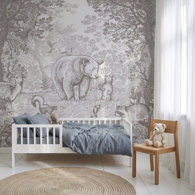
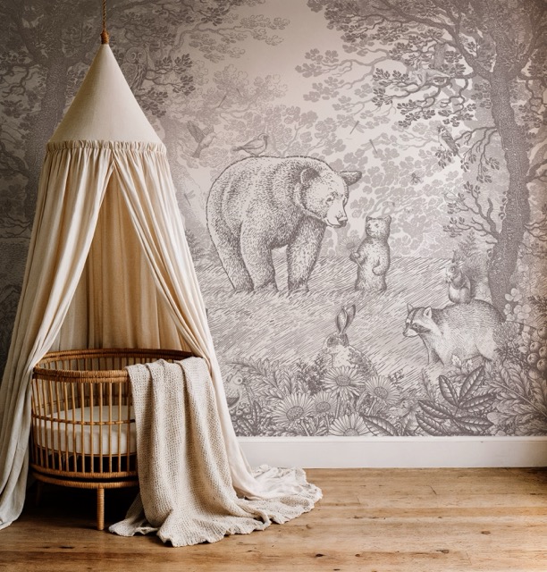
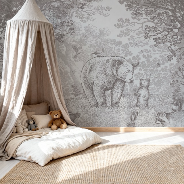
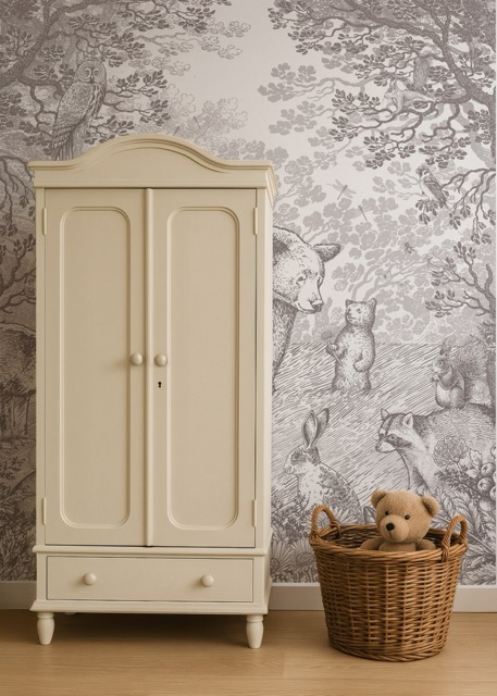
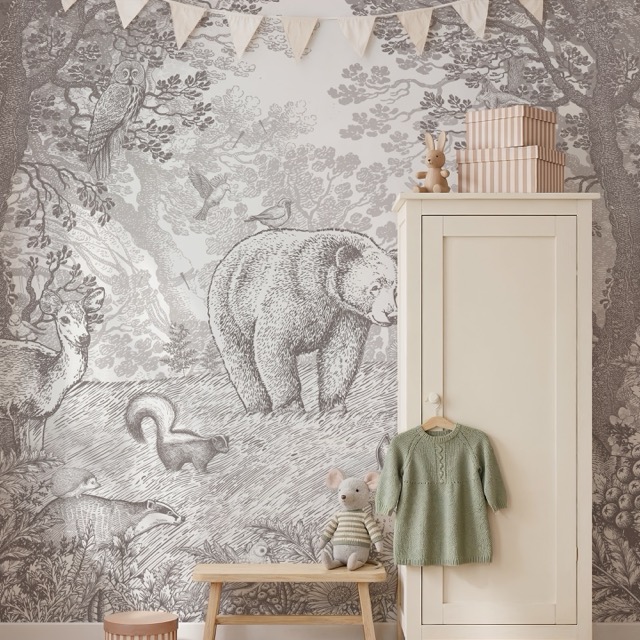
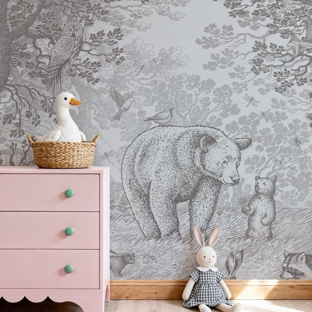
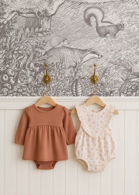
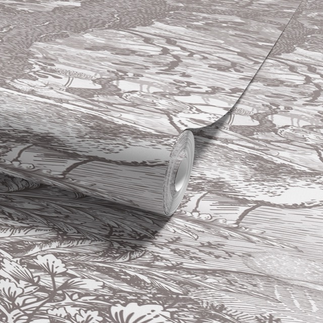
Nursery context in soft natural light. Botanical / woodland motifs (birds, branches, deer, hedgehogs, foxes). Child + room context preferred over isolated wallpaper rolls. Warm terracotta / cream undertones — occasionally cool for nighttime designs. Never desaturated, never punchy.
Voice & tone
oudroze · soft pink · #fdeee9
Speak as two sisters sharing what they love, not as a company. Always informal Dutch je / jij / jouw — never u / uw. Sensory scene-painting, child-centred discovery, never feature lists.
Informal Dutch je / jij / jouw. English market: "your little one", British spelling (colour, cosy). German market: du, not Sie — compound nouns welcome (Waldabenteuer). Gender-neutral always — "je kindje", never "voor meisjes / jongens".
2–4 sentences max per creative paragraph. 80 words max. One exclamation mark per sentence, max. Rhetorical questions are an active tool — they invite the reader to look closer at hidden details.
"Hoor je de Cheetah ritselen door het gras? En de wind waaien door de tropische bomen? Laat je meevoeren door deze prachtige palmentuin en kom helemaal tot rust."
No hard-sell, no urgency, no superlative claims, no competitor comparisons, no formal address. Emoji rarely; never in body copy or product descriptions. Diminutives (-je / -tje) are fine in moderation — overusing them becomes saccharine.
Foundation · 01
Warm neutrals with a terracotta pop. Never pure black, never pure white, never cool blues as primary. The brand should read like a sun-warmed nursery, not a tech product.
Accent
#3d3935
potloodgrijs · warm charcoal · --color-accent
Accent hover
#2a2723
darkened accent · --color-accent-hover
Secondary
#c96a38
terracotta · the pop · --color-secondary
Secondary hover
#a85628
deeper terra · --color-secondary-hover
Light
#fdeee9
oudroze · soft pink card bg · --color-light
Lighter / page bg
#fdfaf6
off-white · never pure white · --color-lighter, --bg
Card bg
#ffffff
true white · product cards · --bg-card
Heading text
#2a2a2a
slightly darker for hierarchy · --fg-1
Body text
#333333
readable, not harsh black · --fg-2
Muted text
#666666
captions, meta · --fg-3
Hint / disabled
#999999
placeholders, disabled · --fg-4
Border
#e5e5e5
dividers, input borders · --border
Inner-border ink
rgba(0,0,0,.08)
signature 8px inset · --border-inner
Foundation · 02
Original Charcoal is the default. Five additional explorations — sage, desert, plum, coastal, autumn — swap via [data-theme="…"] on the page root. All maintain the warm-artisanal feel.
[default][data-theme="sage"][data-theme="desert"][data-theme="plum"][data-theme="coastal"][data-theme="autumn"]Foundation · 03
potloodgrijs · warm charcoal · #3d3935
Lora serif at weight 400 for headings — never bold display text, quality over loudness. Karla sans for body, labels, buttons. Both load from Google Fonts. Display sizes get tight leading; body line-height is 1.6.
Foundation · 04
Strict 8px grid. Do not improvise off-grid values. Container max width 1200px; gutter --space-md (24px) desktop, --space-sm (16px) mobile.
Radius
3px
universal corner · --radius
Radius pill
999px
round-ended only · --radius-pill
Container
1200px
desktop max width · --container
Transition
all 0.3s ease
single curve · --transition
Foundation · 05
Subtle. 0 2px 5px rgba(0,0,0,.05) at rest, 0 4px 12px rgba(0,0,0,.10) on hover. No deep drop shadows. The signature elevation effect is the inner-border ink — not weight.
The system rests on paper, not glass. Most surfaces sit flush with the page — separation is drawn with hairlines, not depth. Shadow is reserved for the few places where one piece of paper truly lifts above another.
The default. No shadow. Edges via hairline rules of rgba(31,27,24,.10).
A single sheet of paper resting on the table. Cards, tooltips, hover state.
The cart drawer, the active modal. One layer above everything else. Rare.
Foundation · 06
Line-art SVG. Single-colour. Inherits currentColor. ~1.5px stroke at 24×24 nominal. No emoji in product copy or UI labels. No unicode symbols as icons. Lucide is allowed as a flagged fallback if a needed icon is not in the set.
Component · signature
oudroze · soft pink · highlights the ink
The brand's visual fingerprint. Every card and section gets a subtle 1px inset border at rgba(0,0,0,.08), drawn 8px from the edge with ::before, pointer-events:none. It is the one thing that makes the brand recognisable on a fast scroll.
The signature. 8px inset, rgba(0,0,0,.08).
::before on every card, panel and section. pointer-events:none so it never blocks clicks. This is the brand's visual fingerprint.Component
Primary (accent fill), secondary (ghost, fills on hover), text-only. Radius 3px across the board. Hover darkens primary or fills ghosts — no scale, no lift, no rotation. Focus is a 2px outline at accent with 2px offset.
Component
Pills for tags, status and price stickers. border-radius: 999px for round-ended pills; otherwise the universal 3px. Use terracotta sparingly — it's the pop, not the default.
Component
1px solid #e5e5e5 border on inputs, dividers. 3px radius. Focus is the standard 2px accent outline at 2px offset. No tinted backgrounds; inputs sit on the off-white page directly.
Component
kraft · cards float warmer on warmth
The workhorse. White background, subtle shadow, inner 8px-inset border. --space-lg (32px) inner padding. Title in Lora; price in Karla 700 + terracotta. Three variants: scale-indicator, dimension-overlay, and circular image.
The product card is the smallest editorial surface we make. Treat it like a specimen page, not a shopping tile — one image with the inverted hairline that runs through the rest of the system, one italic name, the specs whispered in monospace, and the price set in oldstyle figures so it reads made, not marketed.
nieuw
pmb-001 · № 17
in voorraad
pmb-007
bestseller
pmb-014 · al 14 jaar
campagne · voorjaar
pmb-001 · № 17 · voorjaar
stl-001
cir-014
kl-01
kl-02
kl-03
kl-04
Component
A four-step circular scale — avatar (80px), button (56px), icon (48px), badge (24px). Anything circular uses border-radius: 50%. No mixed-radius compositions.
In situ
Full assemblies — components composed into real surfaces. The consumer-web kit is the canonical reference for the customer storefront (Header w/ tuned mega menu, hero, product grid, product detail, cart drawer, footer). The wallgen kit is intentionally off-brand.
Rules
potloodgrijs · rule-of-the-brand
Cross-cutting rules that govern motion, interaction, and structure. Apply everywhere unless a specific component explicitly overrides them.
Single shared value: all 0.3s ease. Apply everywhere. No bounce, no overshoot, no spring physics — the brand is gentle.
Primary buttons darken to --color-accent-hover. Ghost buttons fill with accent. Links underline and shift toward accent. Cards deepen shadow from subtle → hover. No scale, no lift, no rotation.
2px outline at --color-accent, 2px offset. Always visible. Never outline:none.
Page background is off-white #fdfaf6, never bright #fff and never grey. No abstract gradients, no glassmorphism, no tech-product mood.
Universal 3px for buttons, inputs, cards. 50% for any circle element. 999px for pills. No mixed-radius compositions.
Container max width 1200px. Product grid repeat(auto-fill, minmax(250px, 1fr)), gap 24px. Breakpoints: 768 (tablet), 992 (desktop).
Used sparingly. Scale indicators on product imagery use rgba(255,255,255,.9). No backdrop-filter blur — this brand is natural, not glassy.
Site header is fixed at top with a subtle bottom shadow. No floating bars, no banners, no urgency timers, no parallax stunts, no scroll-jacking.
No protection gradients. The brand prefers solid colour fields and inner borders over gradient overlays. Pills are used for tags, status, and price stickers.