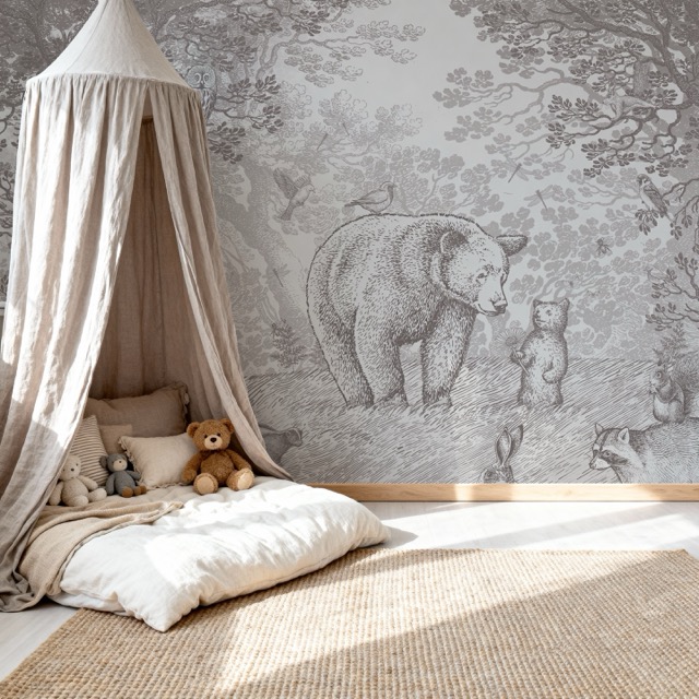
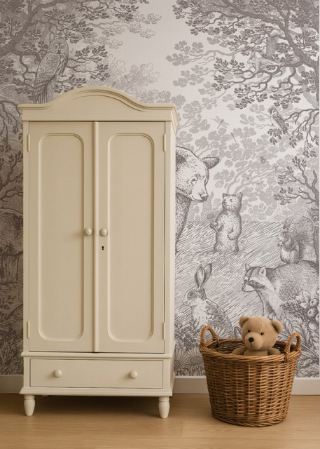
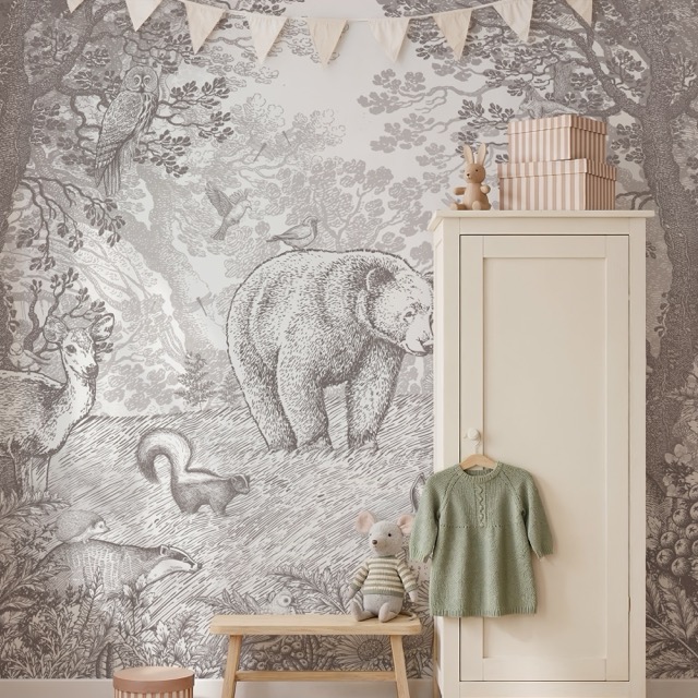
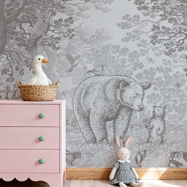
A Pimpelmees brand book — Utrecht, est. 2009

Warm, magical, never corporate.

Pimpelmees is a Dutch wallpaper brand for children's rooms, founded by sisters Marieke and Ingeborg — both members of the BNO. Behang, behangcirkels, muurstickers, behangbogen, drieluiken and behangrand, hand-illustrated, nature-inspired, printed in Utrecht.

"Tover de kinderkamer om tot het fijnste plekje in huis met ons magische behang."

Voice · informal Dutch · two sisters, not a company Markets · NL · EN · DE Stores · pimpelmeesbehang.com · pimpelmeeswallpaper.com

Identity

kraft · printed-paper warm tan · #e8dec8

Logos & marks

Primary wordmark, monograms, square mark and faviconography — eight files for the right surface. Inherit colour where possible (terracotta / cream / dark variants); use the open / frameless wordmark on kraft footers.

01

Primary mark

framed · canonical
02

Anatomy

five elements, exact widths

Five elements, no more

Five elements, no more. Outer rule at 1.5 pt, inner hairline at 0.5 pt, the bold wordmark (glyph-1-*), a 0.5 pt separator whose length equals the wordmark's exact width, and the italic tagline (glyph-0-*). All measurements are lifted from the canonical SVG — no approximations.

Clear space

Keep x of empty space on every side, where x equals the cap-height of the wordmark. No type, image, edge or fold should encroach.

03

Surfaces

how it sits on colour
Default · eierschaal#fafaf6
On kraft#e8dec8
Reversed#1f1b18
On terracotta#c96a38
On oudroze#fdeee9
On sage#5a6b5d
04

Open variant

when the frame doesn't belong

For invoices, packing slips, e-mail signatures and any context where the framed mark feels heavy or competes with surrounding rules, drop the outer borders. Wordmark, separator and tagline remain unchanged.

Openno frame
Open · kraftno frame
Open · reversedno frame
05

Lockups

format-specific
Horizontalframed
Openno frame
Monogramframed P
Wordmark onlyno frame, no tag
06

Favicon & app icon

scale-down behaviour
16 px
24 px
32 px
48 px
64 px
96 px
128 px
Below 64 px the full lockup
becomes a single capital P inside the frame.
07

Don'ts

things that break the mark
× rotatethe frame is the mark
× stretchpreserve aspect
× on gradientuse flat fields only
PIMPELMEES
× wrong typefaceuse the canonical glyphs
  • Don't substitute Montserrat (or any other typeface) for the canonical wordmark — use the SVG glyphs.
  • Don't recolour the frame and the wordmark separately — both move together.
  • Don't fill the inner frame with imagery or texture.
  • Don't apply drop shadows, glows, bevels or filters.
Glyph provenance Every framed mark on this page is composed from the exact glyph paths in assets/logo-pimpelmees.svg — the wordmark uses glyph-1-0 … glyph-1-5, the tagline uses glyph-0-0 … glyph-0-11. The separator's length and stroke weight, both frames, and all glyph positions are lifted verbatim from the source file. NL ("magisch behang") and DE ("zauberhafte Tapeten") taglines are not yet vectorised — the source SVG only carries glyphs for d, a, z, l, i, n, g, w, p, e, r. Drop additional glyph paths (m, s, c, h, b, u, f, t, T) into the defs block to render them in the same letterforms.

Imagery

Lifestyle photography

Nursery context in soft natural light. Botanical / woodland motifs (birds, branches, deer, hedgehogs, foxes). Child + room context preferred over isolated wallpaper rolls. Warm terracotta / cream undertones — occasionally cool for nighttime designs. Never desaturated, never punchy.
Voice & tone

oudroze · soft pink · #fdeee9

Warm. Verwonderend. Compact.

Speak as two sisters sharing what they love, not as a company. Always informal Dutch je / jij / jouw — never u / uw. Sensory scene-painting, child-centred discovery, never feature lists.

Address & person

Informal Dutch je / jij / jouw. English market: "your little one", British spelling (colour, cosy). German market: du, not Sie — compound nouns welcome (Waldabenteuer). Gender-neutral always — "je kindje", never "voor meisjes / jongens".

Hoor je de Cheetah ritselen door het gras?
Dit behang bevat een afbeelding van een cheetah.

Rhythm

2–4 sentences max per creative paragraph. 80 words max. One exclamation mark per sentence, max. Rhetorical questions are an active tool — they invite the reader to look closer at hidden details.

"Hoor je de Cheetah ritselen door het gras? En de wind waaien door de tropische bomen? Laat je meevoeren door deze prachtige palmentuin en kom helemaal tot rust."

Power words — use freely

  • prachtig
  • oogstrelend
  • sfeervol
  • betoverend
  • tijdloos
  • magisch
  • sprookjesachtig
  • dromerig
  • wonderlijk
  • fijn
  • gezellig
  • warm
  • knus
  • ontdekken
  • ontdekkingstocht
  • avontuur
  • meevoeren
  • waan je
  • ritselen
  • fladderen
  • dobberen
  • schitteren

Dutch colour vocabulary — never just "brown"

  • potloodgrijs
  • terracotta
  • oudroze
  • mosterd
  • zeegroen
  • nachtblauw
  • olijfgroen
  • zand
  • goud
  • koper
  • zilver

Forbidden — never

  • bestel nu
  • alleen vandaag
  • op=op
  • must-have
  • limited edition
  • de nummer 1
  • assortiment
  • aanbod
  • portfolio
  • gamma
  • u / uw
  • voor meisjes
  • voor jongens

No hard-sell, no urgency, no superlative claims, no competitor comparisons, no formal address. Emoji rarely; never in body copy or product descriptions. Diminutives (-je / -tje) are fine in moderation — overusing them becomes saccharine.

Foundation · 01

Colour

Warm neutrals with a terracotta pop. Never pure black, never pure white, never cool blues as primary. The brand should read like a sun-warmed nursery, not a tech product.

Accent

#3d3935 potloodgrijs · warm charcoal · --color-accent

Accent hover

#2a2723 darkened accent · --color-accent-hover

Secondary

#c96a38 terracotta · the pop · --color-secondary

Secondary hover

#a85628 deeper terra · --color-secondary-hover

Light

#fdeee9 oudroze · soft pink card bg · --color-light

Lighter / page bg

#fdfaf6 off-white · never pure white · --color-lighter, --bg

Card bg

#ffffff true white · product cards · --bg-card

Heading text

#2a2a2a slightly darker for hierarchy · --fg-1

Body text

#333333 readable, not harsh black · --fg-2

Muted text

#666666 captions, meta · --fg-3

Hint / disabled

#999999 placeholders, disabled · --fg-4

Border

#e5e5e5 dividers, input borders · --border

Inner-border ink

rgba(0,0,0,.08) signature 8px inset · --border-inner

Foundation · 02

Six themes

Original Charcoal is the default. Five additional explorations — sage, desert, plum, coastal, autumn — swap via [data-theme="…"] on the page root. All maintain the warm-artisanal feel.

Original Charcoal

[default]

Sage

[data-theme="sage"]

Desert

[data-theme="desert"]

Plum

[data-theme="plum"]

Coastal

[data-theme="coastal"]

Autumn

[data-theme="autumn"]

Foundation · 03

potloodgrijs · warm charcoal · #3d3935

Typography

Lora serif at weight 400 for headings — never bold display text, quality over loudness. Karla sans for body, labels, buttons. Both load from Google Fonts. Display sizes get tight leading; body line-height is 1.6.

Scale

Display48 / 1.1
Lora 400
Magisch behang
H132 / 1.2
Lora 400
Tover de kinderkamer om
H224 / 1.2
Lora 400
Hoor je de Cheetah ritselen?
H320 / 1.3
Lora 400
Een ontdekkingstocht in de bossen
H418 / 1.3
Lora 400
Wat zit er in deze collectie?
Body16 / 1.6
Karla 400
Laat je meevoeren door deze prachtige palmentuin en kom helemaal tot rust. Hier ritselt het gras, fladderen de vlinders en dobberen kleine bootjes op de wind.
Small14 / 1.5
Karla 400
Vliesbehang, in oplage gedrukt in Utrecht. 200 × 280 cm.
XS12 / 1.4
Karla 500
Levertijd 3–5 werkdagen · gratis verzending vanaf €75
Micro10 / 1.4
Karla 700 caps
№ 17 · Voorjaarscollectie

Line-heights

--lh-tight1.2
display, h1–h4
Tover de kinderkamer om tot het fijnste plekje
in huis met ons magische behang.
--lh-snug1.4
captions, labels, micro
Korte regels die dicht op elkaar mogen staan — labels, captions, micro-copy.
--lh-body1.6
paragraphs
Voor lopende tekst geeft 1.6 lucht zonder de regels uit elkaar te trekken. Goed voor lange beschrijvingen en blogposts.

Foundation · 04

Spacing

Strict 8px grid. Do not improvise off-grid values. Container max width 1200px; gutter --space-md (24px) desktop, --space-sm (16px) mobile.

--space-xs8 px
--space-sm16 px
--space-md24 px
--space-lg32 px
--space-xl48 px
--space-2xl64 px
--space-3xl96 px

Radius, layout, motion

Radius

3px universal corner · --radius
badge / pill

Radius pill

999px round-ended only · --radius-pill
1200px max

Container

1200px desktop max width · --container
all 0.3s ease

Transition

all 0.3s ease single curve · --transition

Foundation · 05

Shadows

Subtle. 0 2px 5px rgba(0,0,0,.05) at rest, 0 4px 12px rgba(0,0,0,.10) on hover. No deep drop shadows. The signature elevation effect is the inner-border ink — not weight.

The system rests on paper, not glass. Most surfaces sit flush with the page — separation is drawn with hairlines, not depth. Shadow is reserved for the few places where one piece of paper truly lifts above another.

00 rest
— flush —
Flush

The default. No shadow. Edges via hairline rules of rgba(31,27,24,.10).

box-shadow: none
01 held
— held —
Held

A single sheet of paper resting on the table. Cards, tooltips, hover state.

0 1px 0 rgba(0,0,0,.08){'\n'}0 2px 4px rgba(0,0,0,.04)
02 lifted
— lifted —
Lifted

The cart drawer, the active modal. One layer above everything else. Rare.

0 1px 0 rgba(0,0,0,.10){'\n'}0 6px 14px -4px rgba(0,0,0,.08)
In context — flush, held, lifted
Flush — hairline only —
Held — a single sheet —
Lifted — above the page —

Do

  • Prefer hairlines over shadow. A 1 px rgba(31,27,24,.10) border does most of the work.
  • Reserve lifted for the cart drawer, modals, and the one piece of paper that should feel "above".
  • Layer hairline + soft shadow together — the hairline draws the edge, the shadow gives it weight.

Don't

  • No drop shadows on buttons, inputs, badges or icons.
  • No coloured shadows, no glow, no blur radius above 14 px.
  • Never stack three shadow levels — there are only ever two.

Foundation · 06

Iconography

Line-art SVG. Single-colour. Inherits currentColor. ~1.5px stroke at 24×24 nominal. No emoji in product copy or UI labels. No unicode symbols as icons. Lucide is allowed as a flagged fallback if a needed icon is not in the set.

Iconography

Line · 1.5 stroke · 24 viewBox · currentColor
cart
account
search
close
arrow
check
clock
heart
shipping
menu
letter
delivery

Component · signature

oudroze · soft pink · highlights the ink

The inner border

The brand's visual fingerprint. Every card and section gets a subtle 1px inset border at rgba(0,0,0,.08), drawn 8px from the edge with ::before, pointer-events:none. It is the one thing that makes the brand recognisable on a fast scroll.

Inner-border

The signature. 8px inset, rgba(0,0,0,.08).

Applied via ::before on every card, panel and section. pointer-events:none so it never blocks clicks. This is the brand's visual fingerprint.

Component

Buttons

Primary (accent fill), secondary (ghost, fills on hover), text-only. Radius 3px across the board. Hover darkens primary or fills ghosts — no scale, no lift, no rotation. Focus is a 2px outline at accent with 2px offset.

Five button voices, no more. Reach for the primary for the one real action on the page; the secondary for the safe second choice; the link for words that read like a sentence; the ghost for "browse" rather than "buy"; the icon for actions a label would over-explain. Sharp corners, 0.5 px hairlines, no shadows. The arrow does the rest.

01

The five voices

rest · hover · active · disabled
Primarybtn · primary
rest
hover
active
disabled
filled · ink · 1 / page
Secondarybtn · secondary
rest
hover
active
disabled
hairline · open · safe second
Text linklink
italic · sentence · inline
Ghostghost
editorial label · navigate
Iconicon · 36 px
rest
hover
active
disabled
round · hairline · 36 / 44
Stampbtn · stamp
rest
hover
accent
rare · special action · 1 / page
02

Sizes

sm · default · lg
Primarybtn · primary
sm · 30
md · 38
lg · 46
3 sizes · cap-height ladder
Secondarybtn · secondary
sm
md
lg
paired with primary at md
Iconicon
sm · 30
md · 36
lg · 44
all three keep stroke 1.5
03

In use

two surfaces, two patterns
Productpagina · actiebalk secondary + primary
Bosdieren behang Vliesbehang · 200 × 280 cm · 4 banen.
89
Bevestiging · dialog link + primary
Staal aanvragen We sturen je gratis een A4 papierstaal — binnen 2–4 dagen op de mat.
misschien later
04

Pairing

how voices sit next to each other
Doprimary + sec
canonical
primary on the right · arrow points forward
Dolink + primary
decision + escape
misschien later
"out" reads quietly, "in" reads loud
Don'ttwo primaries
avoid
one ink rectangle per page · always
Anatomy notes Sharp corners only. 0.5 px hairlines only. No drop shadows, ever. The primary's arrow moves 3 px on hover; the link's gap grows from 8 to 11 px; the ghost's leading rule grows from 18 to 32 px. These motion details are the brand — they say hand-pulled, not generated.

Component

Badges

Pills for tags, status and price stickers. border-radius: 999px for round-ended pills; otherwise the universal 3px. Use terracotta sparingly — it's the pop, not the default.

editorial label Nieuwvoorjaar№ 17 Bestselleral 14 jaar№ 03 Pas geleverdvanmiddag
cataloging chip Vliesbehangmatpmb-001 Ø 100 cmcirkelcir-014 Mosgroenkleur 04
crop-mark tag 200 × 280 cm 4 banen 8 kleurwegen
prijsticket Bosdieren69,00eur · per cirkel Walviswereld89,00eur
prijsticket · stacked Bosdieren behang69per cirkel · ø 100 Walviswereld89vliesbehang · 200×280 Heidehertjes129drieluik · 3×80×120
status · state op voorraad nog 2 op rol op aanvraag gedrukt
pill · attribute 200 × 280 terracotta mosgroen vlies · mat
techniek Vliesbehang · 156 g/m² Geprint in Utrecht FSC papier
brackets met de hand getekend op aanvraag gedrukt geleverd binnen 2–4 dagen
card-tag Bosdierenpmb-001 Heidehertjespmb-031 Walviswereldpmb-014
zegels Met liefde
gemaakt
Atelier
Utrecht
Nº 17
voorjaar
signature ×Marieke & Ingeborg ×Utrecht, 2026
prijs-callout vanaf89vliesbehang · incl. btw cirkel · ø 10069per stuk · incl. btw
callout · in use
Bosdieren behang
Vliesbehang · 200 × 280 cm · 4 banen · direct uit voorraad leverbaar.
89
vanaf

Component

Forms

1px solid #e5e5e5 border on inputs, dividers. 3px radius. Focus is the standard 2px accent outline at 2px offset. No tinted backgrounds; inputs sit on the off-white page directly.

Naam
E-mailadres
Land
Postcode We vinden je adres automatisch.
Een berichtje — optioneel
Je gegevens blijven bij ons, niet bij anderen.

Component

kraft · cards float warmer on warmth

Product cards

The workhorse. White background, subtle shadow, inner 8px-inset border. --space-lg (32px) inner padding. Title in Lora; price in Karla 700 + terracotta. Three variants: scale-indicator, dimension-overlay, and circular image.

The product card is the smallest editorial surface we make. Treat it like a specimen page, not a shopping tile — one image with the inverted hairline that runs through the rest of the system, one italic name, the specs whispered in monospace, and the price set in oldstyle figures so it reads made, not marketed.

01

Canonical · 4 / 5 plate

the default — catalogue, search, related
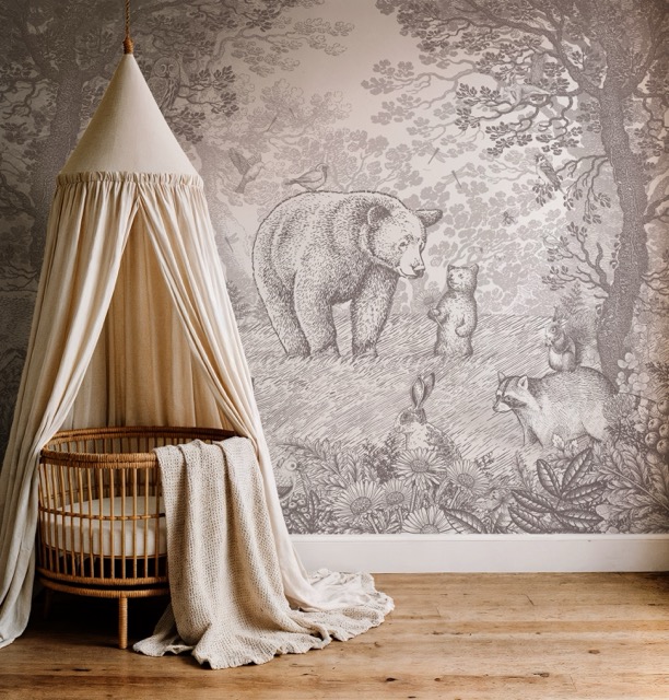
Bosdieren mural with rattan cradle nieuw pmb-001 · № 17
Vliesbehang · bosdieren Bosdieren behang
200 × 280 cm4 banenvlies · mat
89vanaf Bekijken
Bosdieren mural with linen cushions in voorraad pmb-007
Vliesbehang · woudreuzen Woudreuzen, taupe
200 × 280 cm4 banenvlies · mat
89vanaf Bekijken
Bear mural with cream cabinet bestseller pmb-014 · al 14 jaar
Vliesbehang · grote beer Bosdieren, klassiek
200 × 280 cm4 banenvlies · mat
89vanaf Bekijken
02

Feature · 5 / 4 plate

hero placement, paired with stack
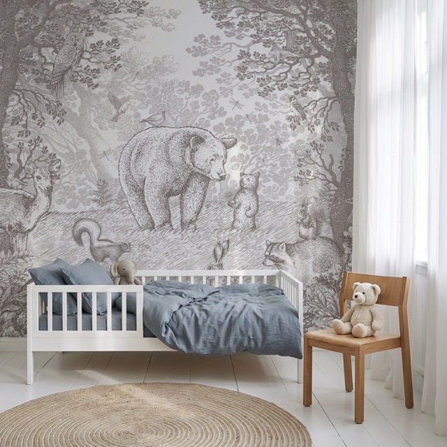
Bosdieren mural with blue bed campagne · voorjaar pmb-001 · № 17 · voorjaar
Voorjaar 2026 · uitgelicht Bosdieren, in de slaapkamer
Hele wand · 280 × 380 cmop maat geprint in UtrechtFSC vlies
129op maat Op maat samenstellen
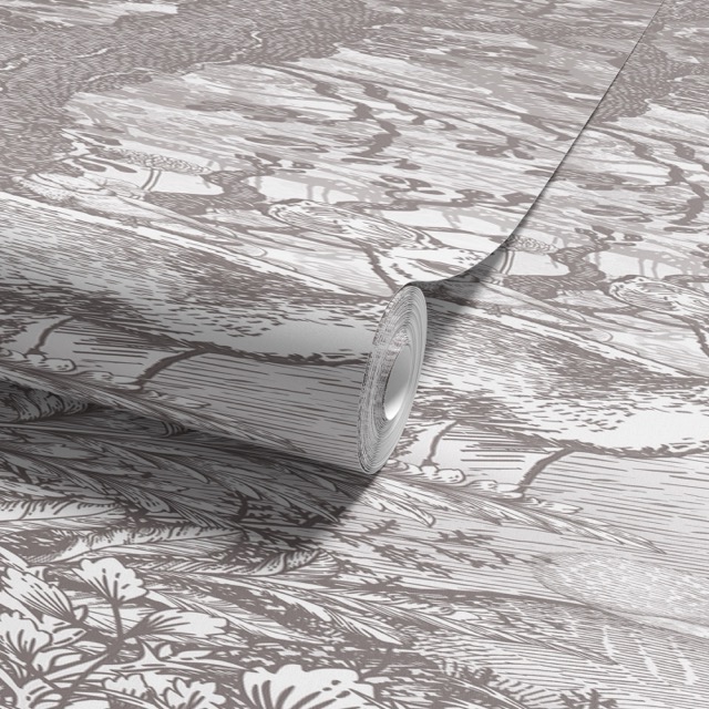
Wallpaper roll close-up stl-001
Staal · gratis A4 papierstaal
21 × 30 cmvlies · mat
0gratis Aanvragen
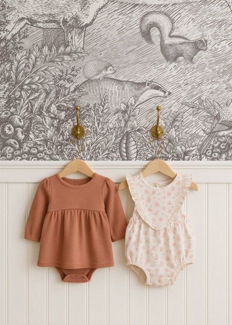
Detail of clothing on hooks cir-014
Behangcirkel · ø 100 Walviswereld
ø 100 cmzelfklevend
69 Bekijken
03

Swatch · 1 / 1 plate

colour-way picker, related variants
Wallpaper roll kl-01
Kleur 01 Potloodgrijs
89 Kies
Cream room with mural kl-02
Kleur 02 Eierschaal
89 Kies
Canopy cradle kl-03
Kleur 03 Mosgroen
89 Kies
Blue room with mural kl-04
Kleur 04 Avondblauw
89 Kies
Anatomy notes The inverted hairline frame is the brand's signature inside the image — same motif as the framed mark, scaled to product dimensions. Never raise the contrast; never use a coloured border. Photography must follow the rules in № 07 · Photography, or the frame will fight the image instead of supporting it.

Component

Circle system

A four-step circular scale — avatar (80px), button (56px), icon (48px), badge (24px). Anything circular uses border-radius: 50%. No mixed-radius compositions.

MI
Avatar · 80
Button · 56
Icon · 48
3
Badge · 24

In situ

UI kits

Full assemblies — components composed into real surfaces. The consumer-web kit is the canonical reference for the customer storefront (Header w/ tuned mega menu, hero, product grid, product detail, cart drawer, footer). The wallgen kit is intentionally off-brand.

Rules

potloodgrijs · rule-of-the-brand

Foundation rules

Cross-cutting rules that govern motion, interaction, and structure. Apply everywhere unless a specific component explicitly overrides them.

Transitions

Single shared value: all 0.3s ease. Apply everywhere. No bounce, no overshoot, no spring physics — the brand is gentle.

Hover

Primary buttons darken to --color-accent-hover. Ghost buttons fill with accent. Links underline and shift toward accent. Cards deepen shadow from subtle → hover. No scale, no lift, no rotation.

Focus

2px outline at --color-accent, 2px offset. Always visible. Never outline:none.

Backgrounds

Page background is off-white #fdfaf6, never bright #fff and never grey. No abstract gradients, no glassmorphism, no tech-product mood.

Borders & radii

Universal 3px for buttons, inputs, cards. 50% for any circle element. 999px for pills. No mixed-radius compositions.

Layout

Container max width 1200px. Product grid repeat(auto-fill, minmax(250px, 1fr)), gap 24px. Breakpoints: 768 (tablet), 992 (desktop).

Transparency

Used sparingly. Scale indicators on product imagery use rgba(255,255,255,.9). No backdrop-filter blur — this brand is natural, not glassy.

Fixed elements

Site header is fixed at top with a subtle bottom shadow. No floating bars, no banners, no urgency timers, no parallax stunts, no scroll-jacking.

Capsules vs gradients

No protection gradients. The brand prefers solid colour fields and inner borders over gradient overlays. Pills are used for tags, status, and price stickers.

Sources & caveats

Where this came from

Bundle assembled from three repos. Cross-checked against the live consumer-brand reference and the iterated UI kit. The MijnWebWinkel live shop layout is not canonical — the brand is mid-migration to Shopify (theme-sleek).

Primary brand source

pimpelmees-design-and-prompt-bundle · BRAND.md · tone-of-voice.md · CSS reference.

Theme template

theme-sleek/ · Foxecom Sleek (Modiva preset). Template only — not the brand voice.

Off-brand reference

wallgen-webui/ · admin tool · cyan / magenta / IBM Plex Mono. Documented to prevent accidental mimicry.

Live references

pimpelmeesbehang.com (NL) · pimpelmeeswallpaper.com (EN) · Instagram @pimpelmees_com · Pinterest @pimpelmees (530+ pins, strongest aesthetic reference).

Substitutions flagged

Fonts: Lora + Karla via Google Fonts. Brandon Grotesque / Garamond Premier Pro / Minion Pro are print-only — never on web. Lucide is an allowed icon fallback (flag the substitution).

Real product imagery

Not bundled. Pull from wallgen/var/catalog/ or the Shopify CDN. The two reference photos are nursery context, not product hero shots.